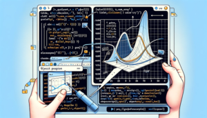

Matplotlibは、論文に使える高品質なグラフを作成するための強力なツールです。
以下に基本的な手順と具体的な例をいくつか示します。
これらの手順を理解し、実践することで、見栄えの良いグラフを作成することができます。
目次
基本設定

まず、Matplotlibをインポートし、基本的な設定を行います。
import matplotlib.pyplot as plt
import numpy as np

# 日本語フォントの設定
plt.rcParams['font.family'] = 'DejaVu Sans'
plt.rcParams['font.sans-serif'] = ['Hiragino Sans', 'Arial', 'Helvetica']

# グラフのスタイル設定
plt.style.use('seaborn-whitegrid')
データの準備
グラフにプロットするためのデータを準備します。
以下は、サンプルデータを生成する例です。
x = np.linspace(0, 10, 100)
y = np.sin(x)
y2 = np.cos(x)
基本的なグラフの作成
最も基本的なグラフを作成します。
plt.figure(figsize=(8, 6))
plt.plot(x, y, label='Sine Wave')
plt.plot(x, y2, label='Cosine Wave')
plt.title('Sine and Cosine Waves')
plt.xlabel('X-axis')
plt.ylabel('Y-axis')
plt.legend()
plt.savefig('basic_plot.png', dpi=300)
plt.show()
論文向けに詳細な設定
論文用のグラフは、細部にわたる設定が必要です。
例えば、軸の範囲、ラベルのフォントサイズ、線の太さなどを調整します。
plt.figure(figsize=(8, 6))

# プロット
plt.plot(x, y, label='Sine Wave', color='blue', linewidth=2.0)
plt.plot(x, y2, label='Cosine Wave', color='red', linestyle='--', linewidth=2.0)

# タイトルとラベル
plt.title('Sine and Cosine Waves', fontsize=16)
plt.xlabel('X-axis', fontsize=14)
plt.ylabel('Y-axis', fontsize=14)

# 軸の範囲
plt.xlim(0, 10)
plt.ylim(-1.5, 1.5)

# ラベルのフォントサイズ
plt.xticks(fontsize=12)
plt.yticks(fontsize=12)

# 凡例
plt.legend(fontsize=12)

# グリッド
plt.grid(True)

# 保存
plt.savefig('detailed_plot.png', dpi=300, bbox_inches='tight')

# 表示
plt.show()
複数プロットのレイアウト
複数のグラフを1つの図にまとめる場合の例です。
fig, axs = plt.subplots(2, 1, figsize=(8, 10))

# 上段プロット
axs[0].plot(x, y, label='Sine Wave', color='blue', linewidth=2.0)
axs[0].set_title('Sine Wave', fontsize=16)
axs[0].set_xlabel('X-axis', fontsize=14)
axs[0].set_ylabel('Y-axis', fontsize=14)
axs[0].legend(fontsize=12)
axs[0].grid(True)

# 下段プロット
axs[1].plot(x, y2, label='Cosine Wave', color='red', linestyle='--', linewidth=2.0)
axs[1].set_title('Cosine Wave', fontsize=16)
axs[1].set_xlabel('X-axis', fontsize=14)
axs[1].set_ylabel('Y-axis', fontsize=14)
axs[1].legend(fontsize=12)
axs[1].grid(True)

# レイアウト調整
plt.tight_layout()
plt.savefig('subplot_example.png', dpi=300, bbox_inches='tight')
plt.show()
カスタムスタイルの適用
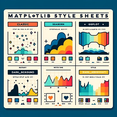
さらに洗練されたスタイルを適用するために、Matplotlibのスタイルシートをカスタマイズすることも可能です。
from matplotlib import style

style.use('ggplot')

plt.figure(figsize=(8, 6))
plt.plot(x, y, label='Sine Wave', color='blue', linewidth=2.0)
plt.plot(x, y2, label='Cosine Wave', color='red', linestyle='--', linewidth=2.0)
plt.title('Sine and Cosine Waves', fontsize=16)
plt.xlabel('X-axis', fontsize=14)
plt.ylabel('Y-axis', fontsize=14)
plt.legend(fontsize=12)
plt.grid(True)
plt.savefig('custom_style_plot.png', dpi=300, bbox_inches='tight')
plt.show()
これらの手順と例を参考にして、論文に使用できる高品質なグラフを作成してください。
さらに、具体的なニーズに応じてカスタマイズすることで、より効果的なデータの視覚化が可能になります。
以上、Matplotlibで論文に使えるグラフの作成方法についてでした。
最後までお読みいただき、ありがとうございました。